05 / 06 · UX / Branding
Course Evaluation Website/App
COURSE EVALUATION WEBSITE/APP
FOR HARVARD STUDENTS
COMPSCI 50: Intro to Computer Science I Fall 2019
Advisor: David Malan
Teammates: FeiXiong RuijunLiu MiaGuo
Project Overview
This project is both the UX design of the website and app as well as the propotype development for the website that help Harvard students better evaluate and select courses. During our research, students (especially graduate students) may feel lost because they could mainly get information from 'myHarvard', the school’s official course webpage. Many students want to hear from their peers who have taken the class. They want to know more about the learning process. Thus we designed this website and app, offering evaluation from peers so that it helps students to make their choice.

USER RESEARCH
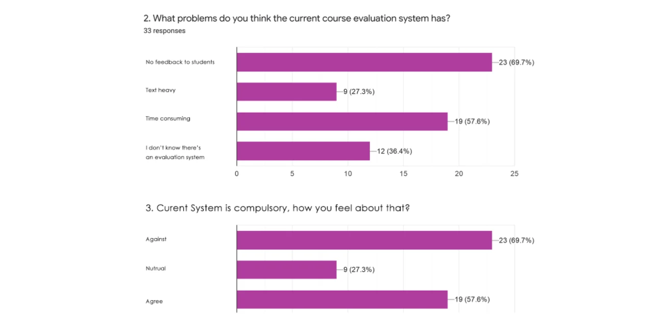
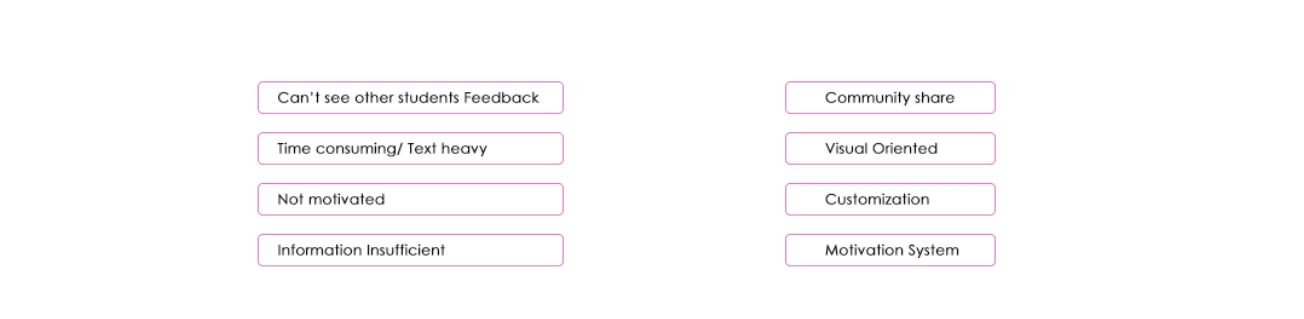
According to the research, most of the students are not satisfied with the current course evaluation system due to its heavy text, inefficient information and non-transparency (students can’t see others feedback).
Overall Understanding
To better define our target users and understand their pains and gain, we conducted the user survey. 37 people shared their answers with us.
1. More than half of participants think " Not having feedback" is the biggest problem the current course evaluation system has
2. More than half of participants disagree with making evaluation system compulsory.
3. All participants are spending more than 15 min to evaluate one course.
Content
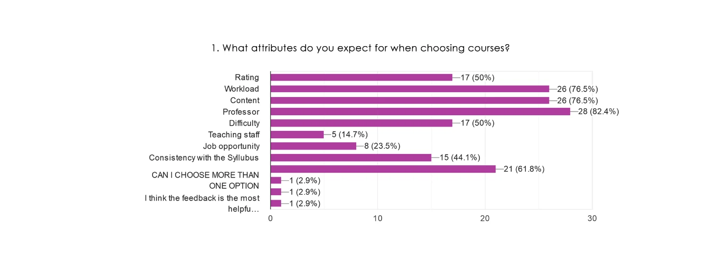
When selecting courses, the top three factors affecting their decisions are Professor, Content, and workload.
Interview
According to the interviews with some students,
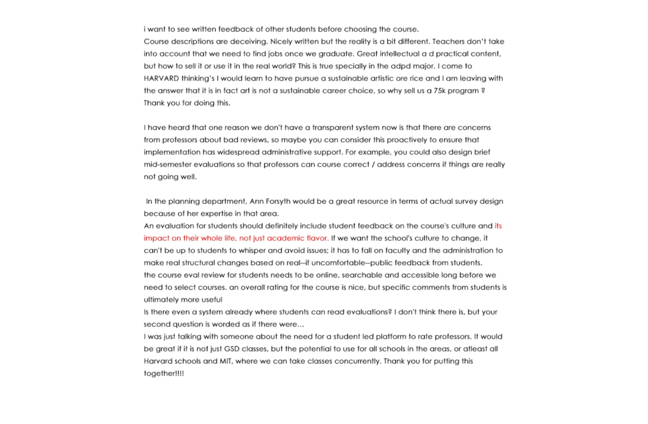
KEY FINDS
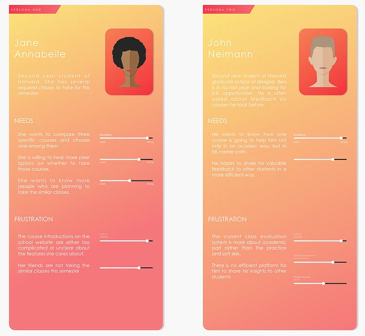
PERSONA
From user research, we synthesized two types of personas that could reflect the identity and characteristics of potential users.
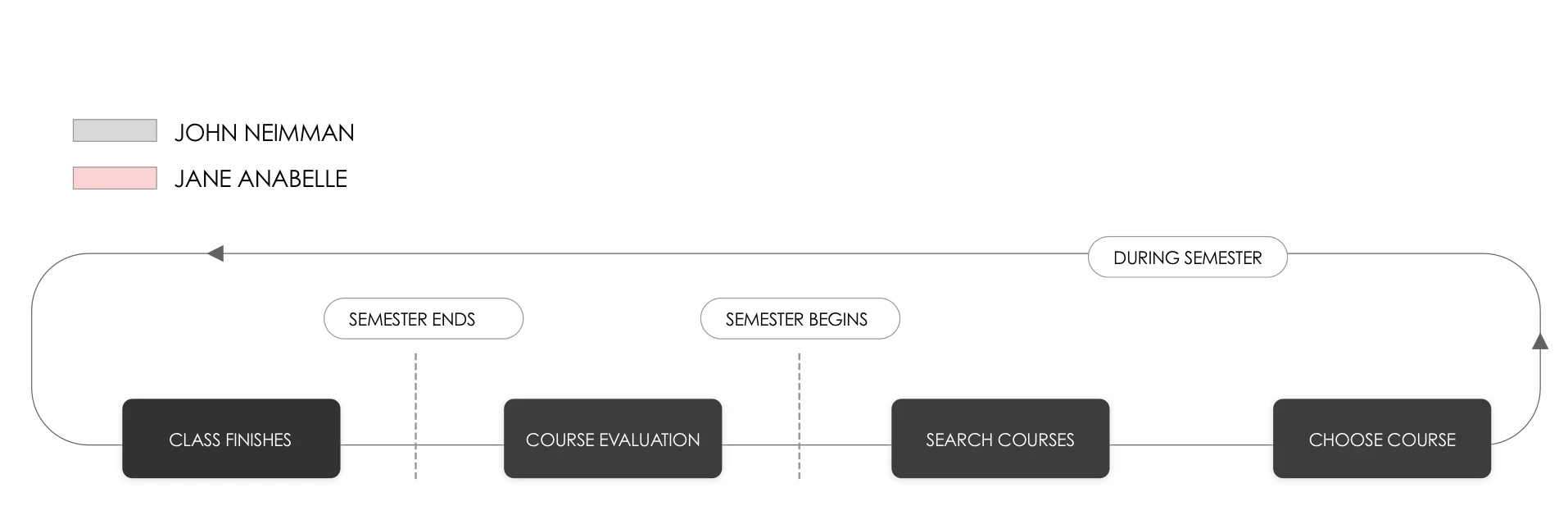
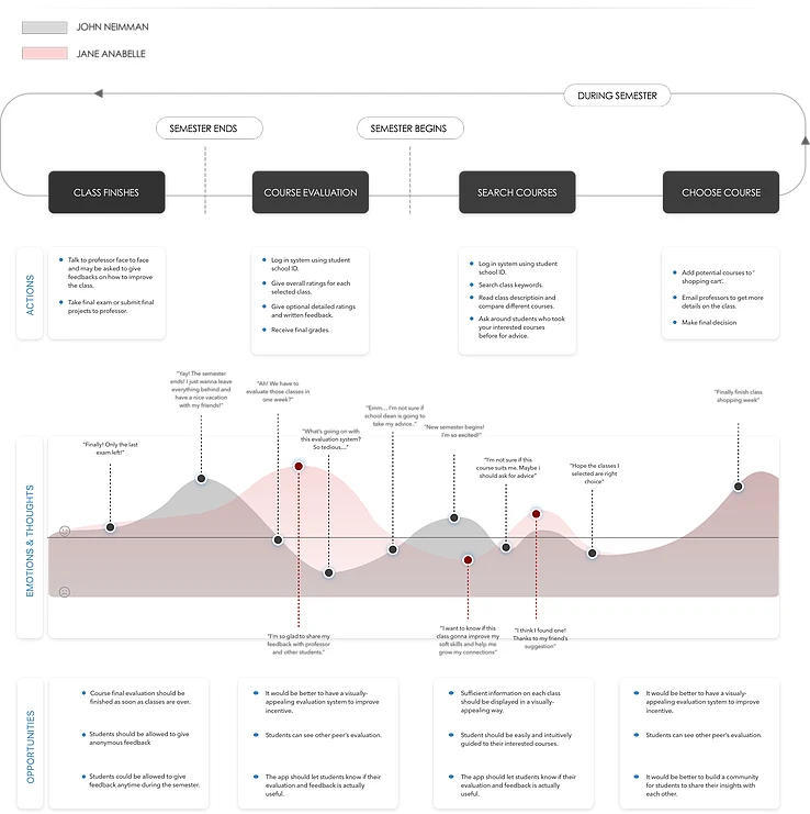
USER JOURNEY MAP

IDEATION
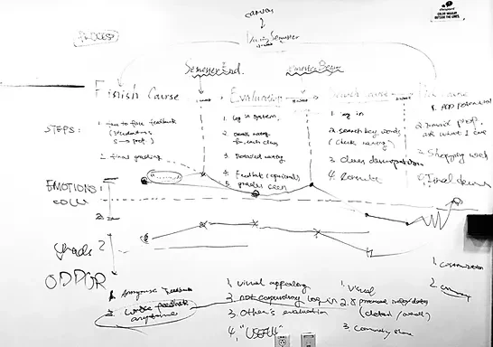
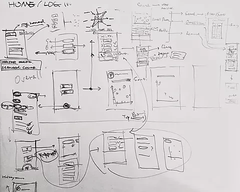
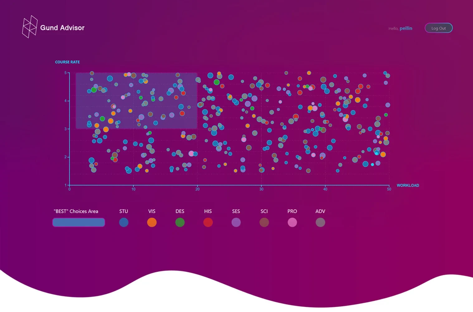
The next step and maybe the most important part is define the ways to visualize different data. According to Maitland Graves' principle of aesthetic order. We use all these basic attributes like orientation, color , shape and value to represent the data with different charts.
PROTOTYPE
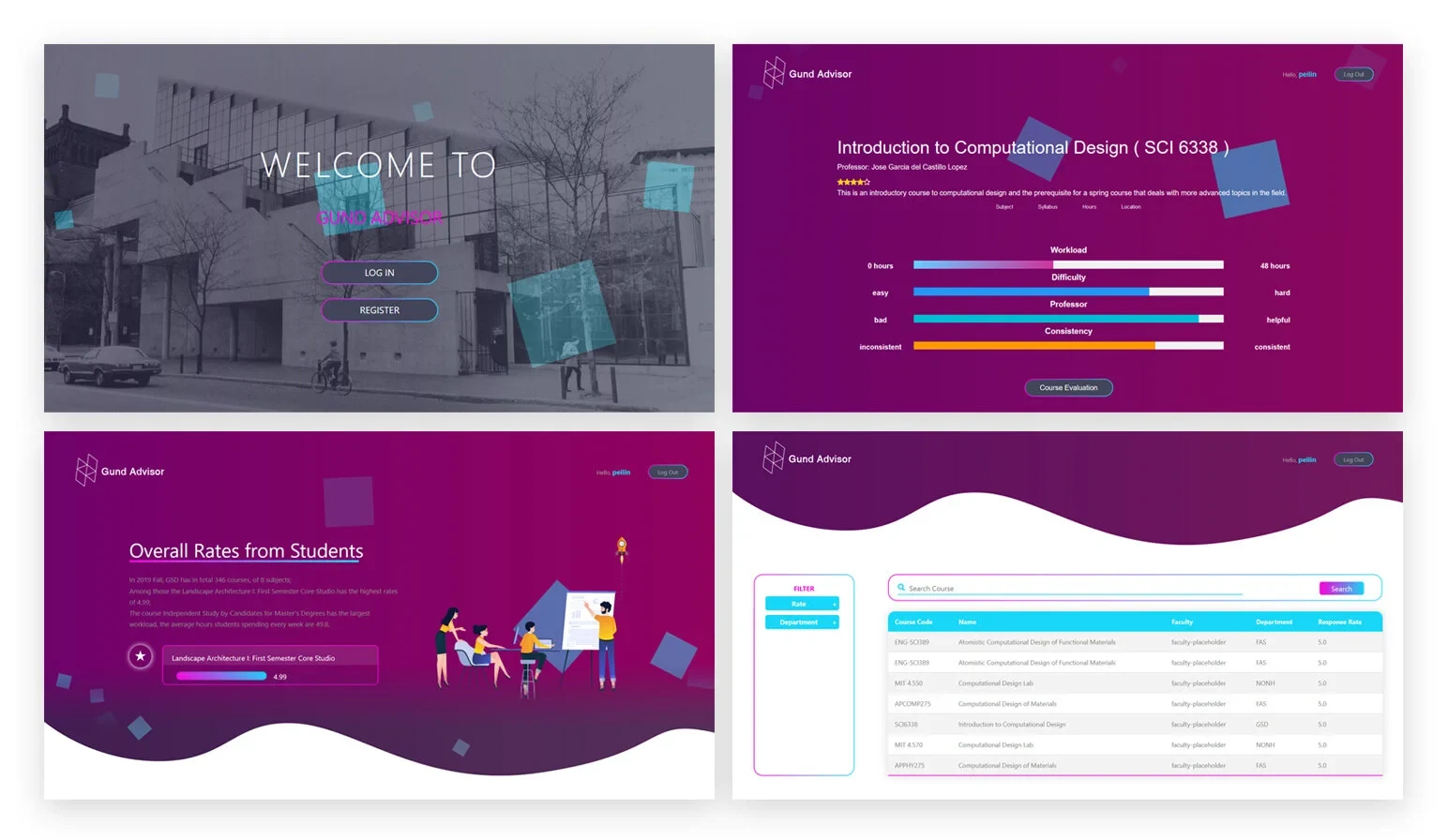
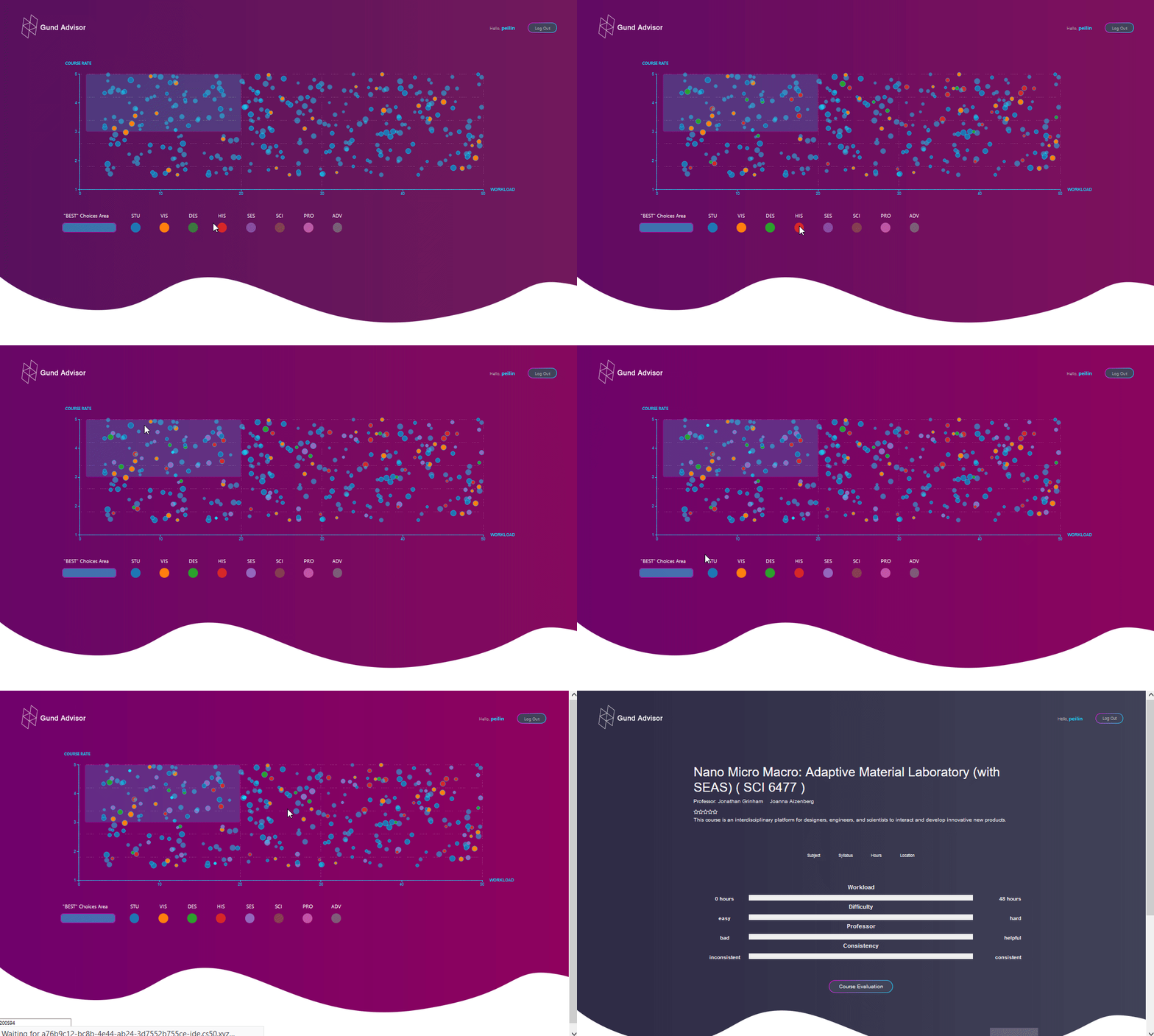
Finally the format was settled with all kinds of data type we want to visualize. Each of them corresponds to some charts that are suitable and easy to read. Also we design the layout by hierarchies and logical orders with reasonable graphic style.
PROTOTYPE - APP
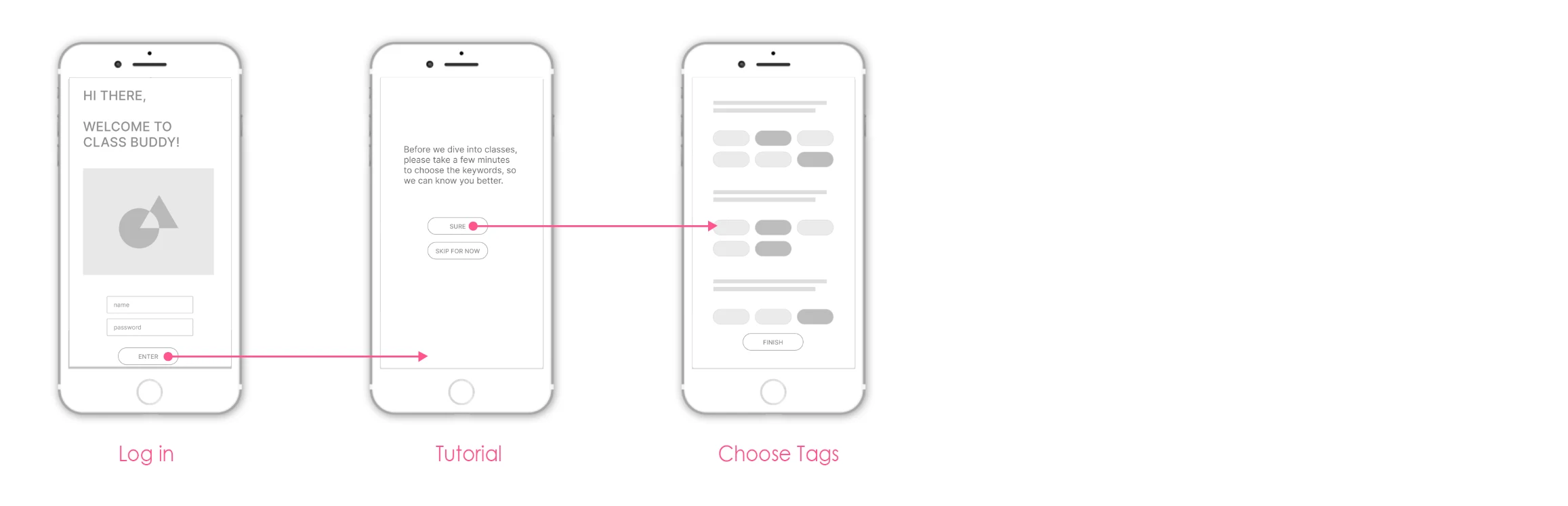
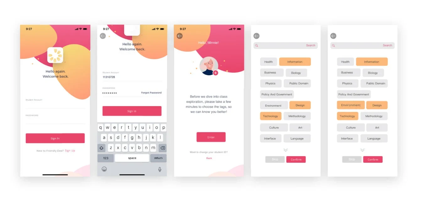
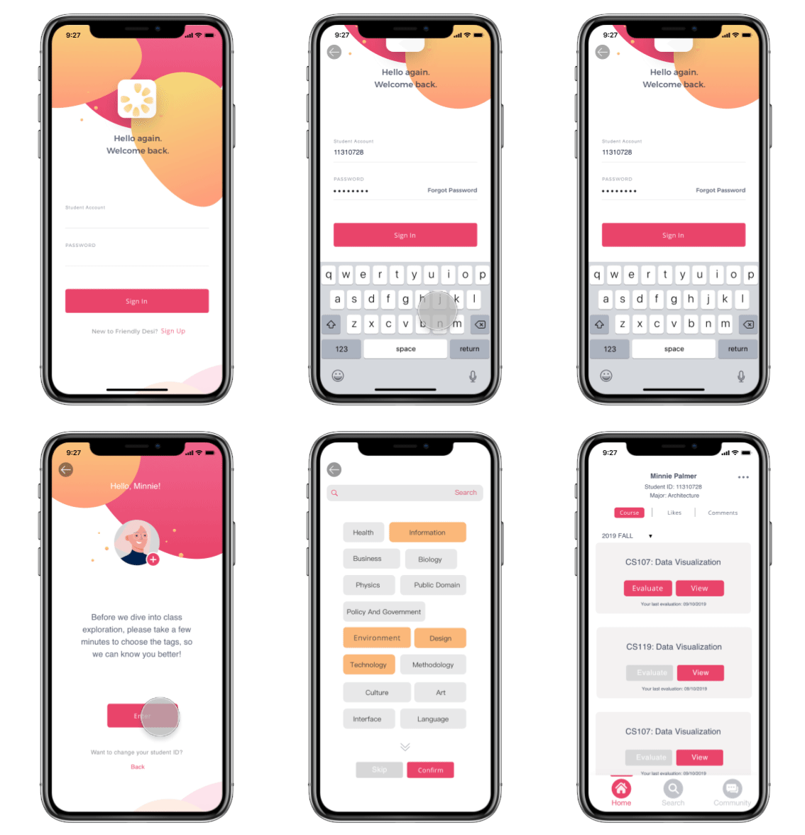
REGISTER & LOG IN
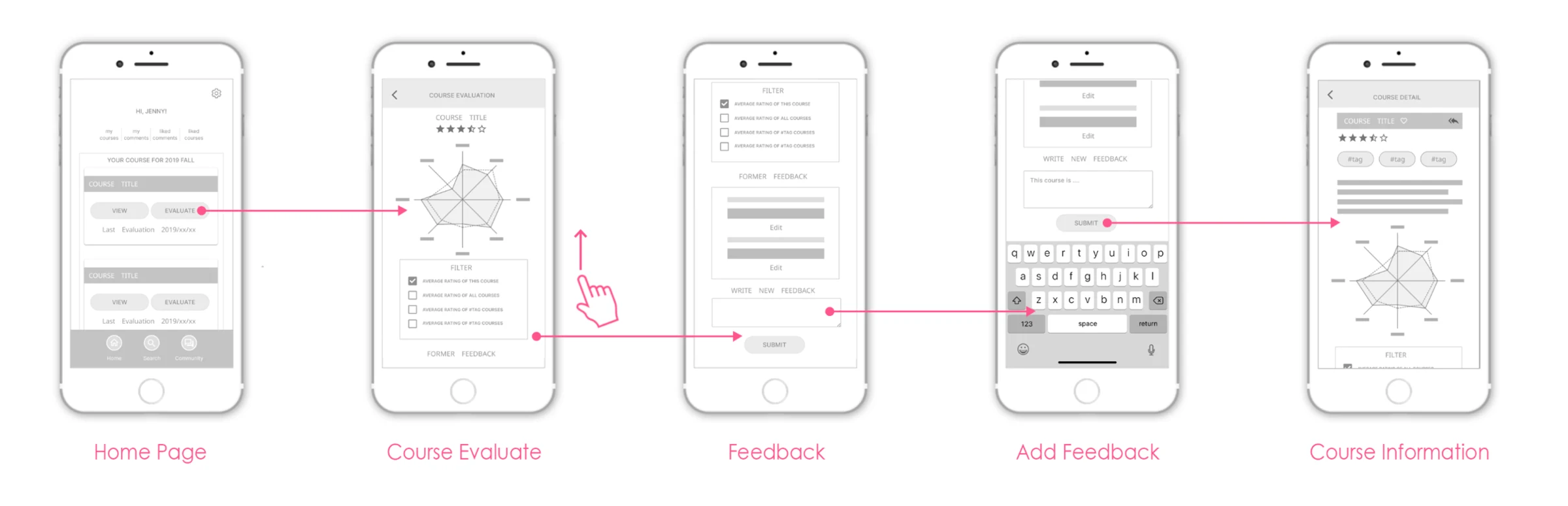
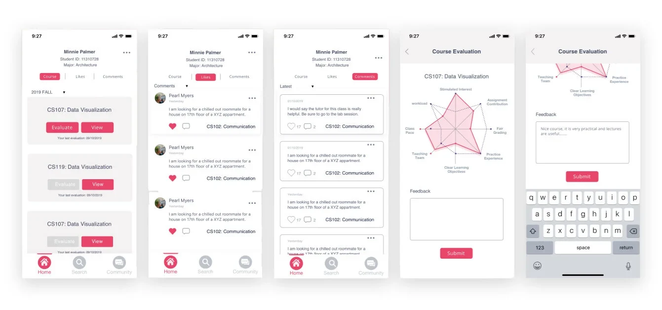
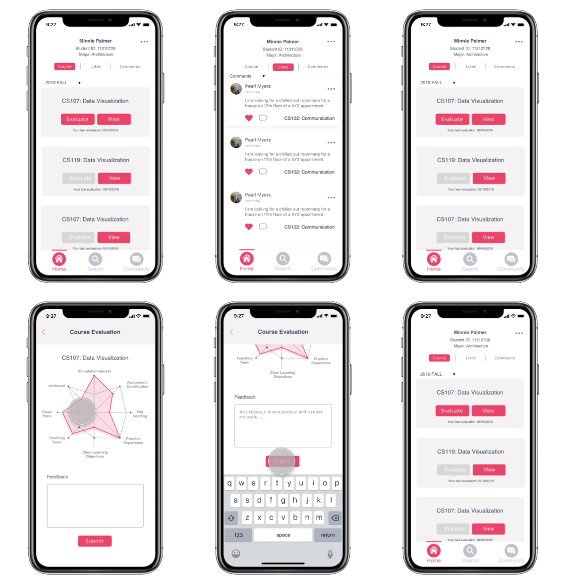
Home & Course Evaluation
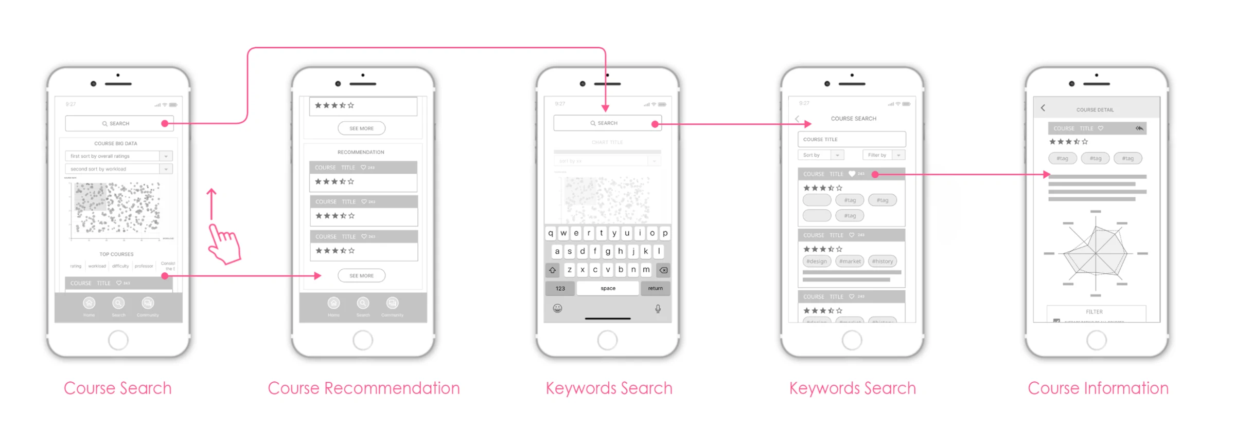
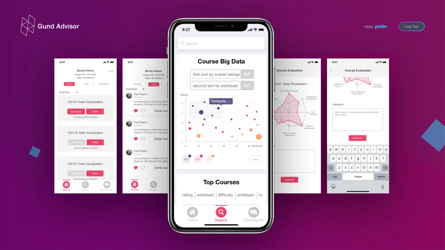
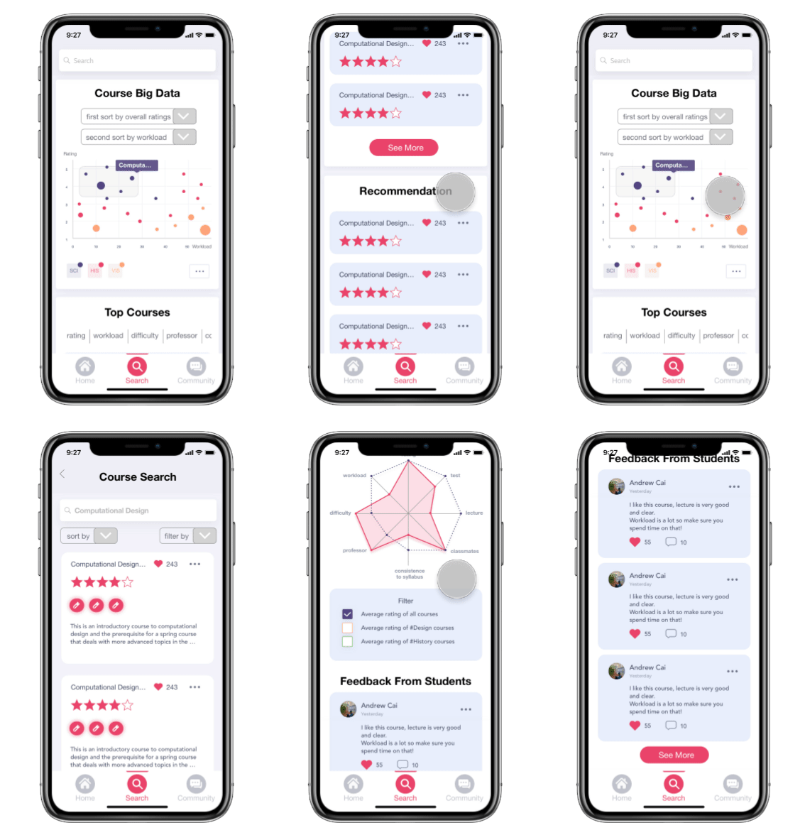
Course Search
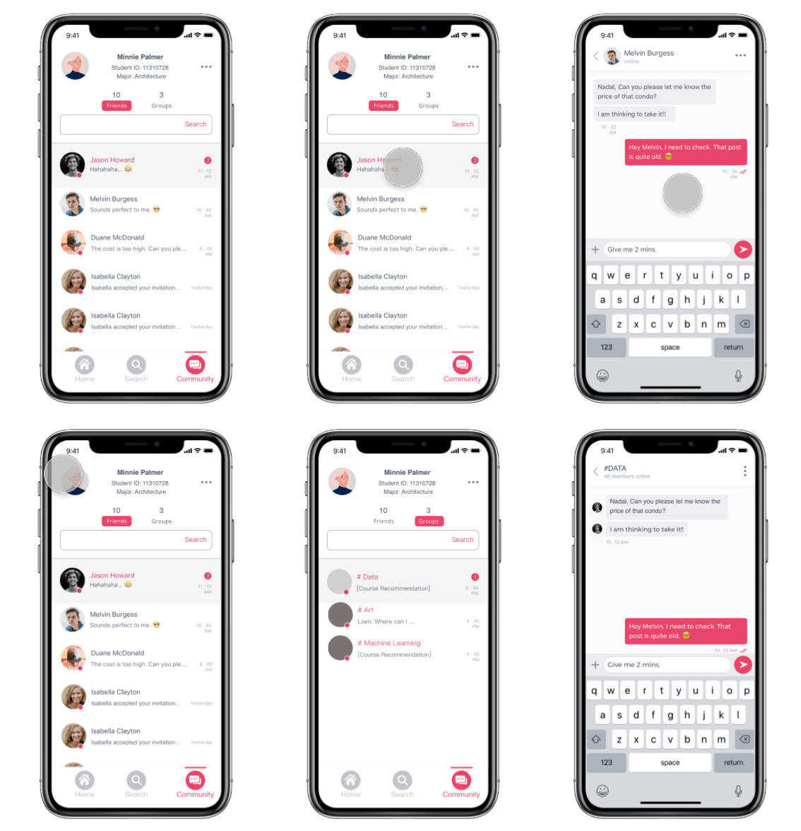
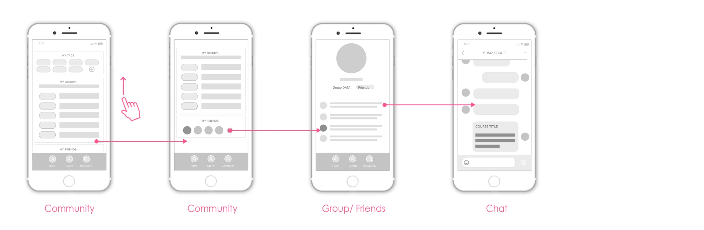
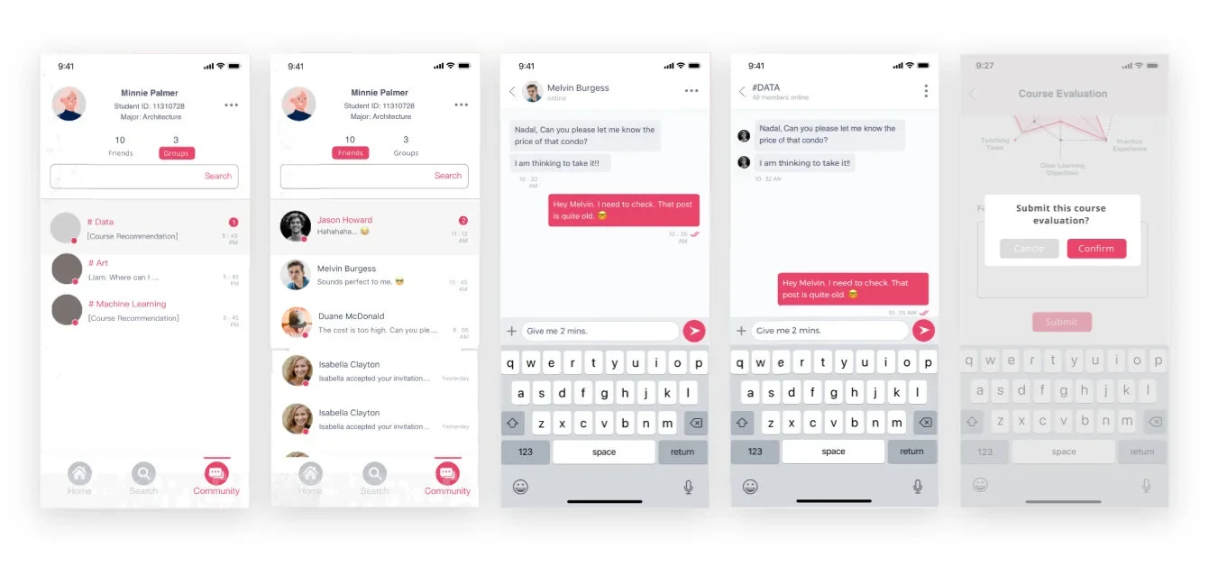
Community
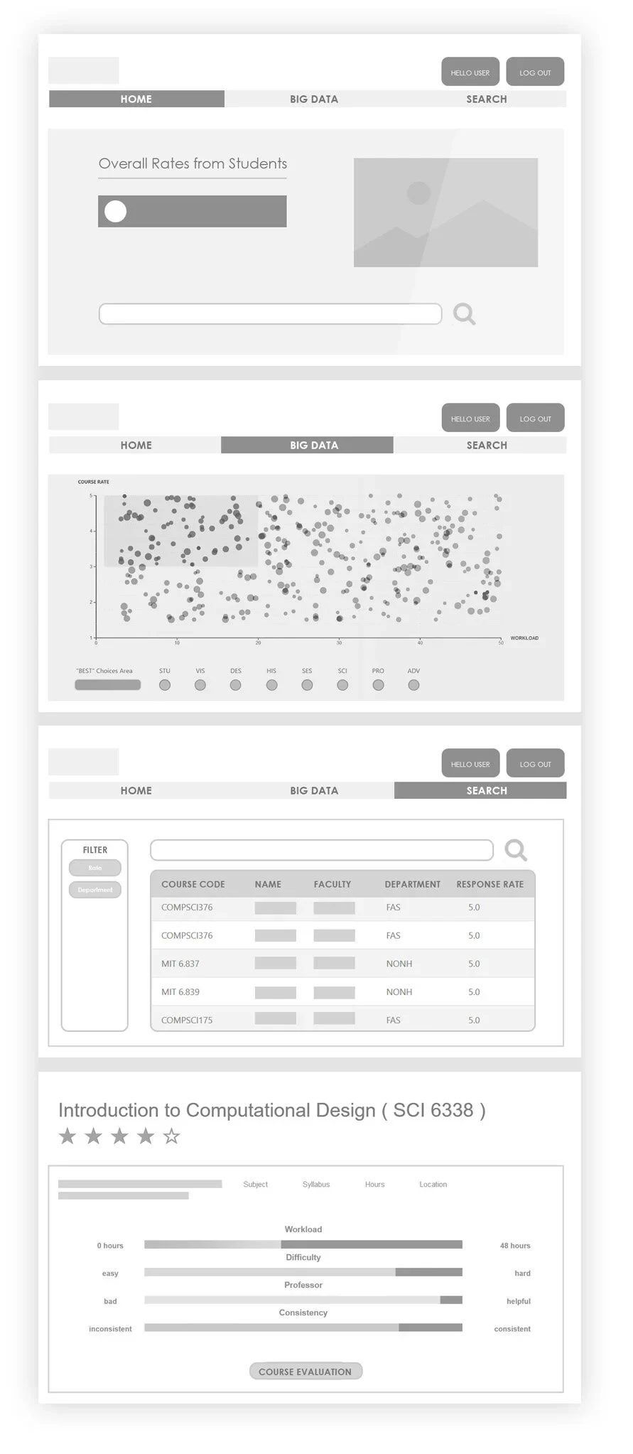
PROTOTYPE - WEBSITE
VISUAL DESIGN
Our scenes are divided by 3 different scales, from a global scale to the city regional scale. In the global scale we show the data of flights, the national scale shows the train information and the city scale is focus on how people are booking hotels. With the transitions between scenes, these three scenarios become a whole story.
DEVELOPMENT
When looking at the stadium itself, we divide this complected building by 3 levels and 6 floors. People can see the real-time population density and attendant rates of all departments. As an individual, it will also be easy to know where are the closest entrances and exits.
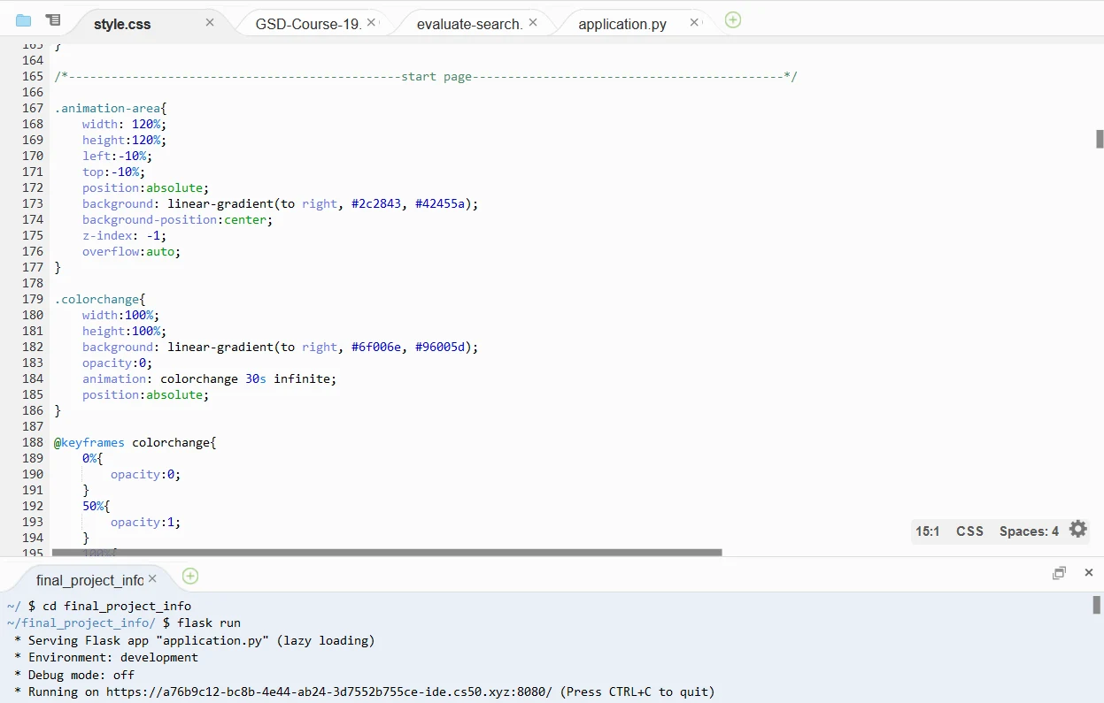
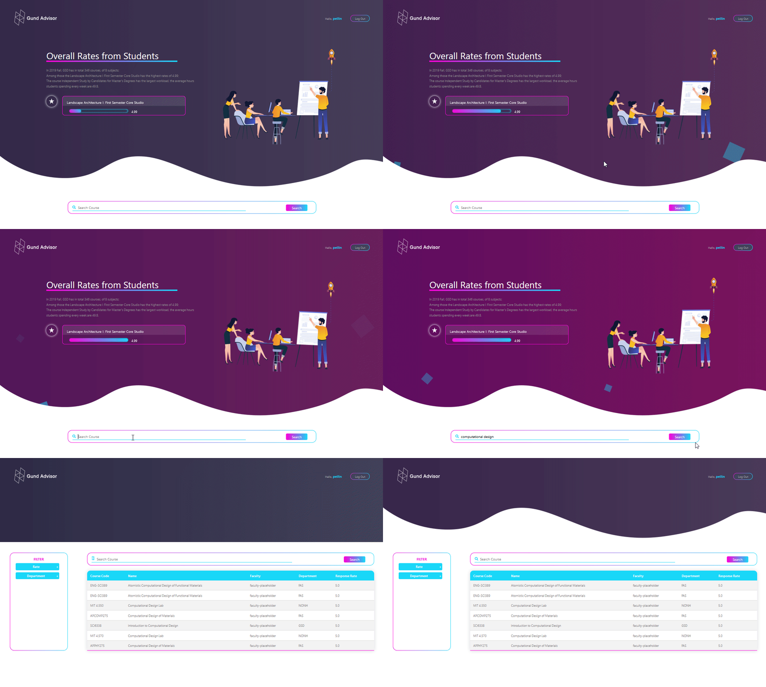
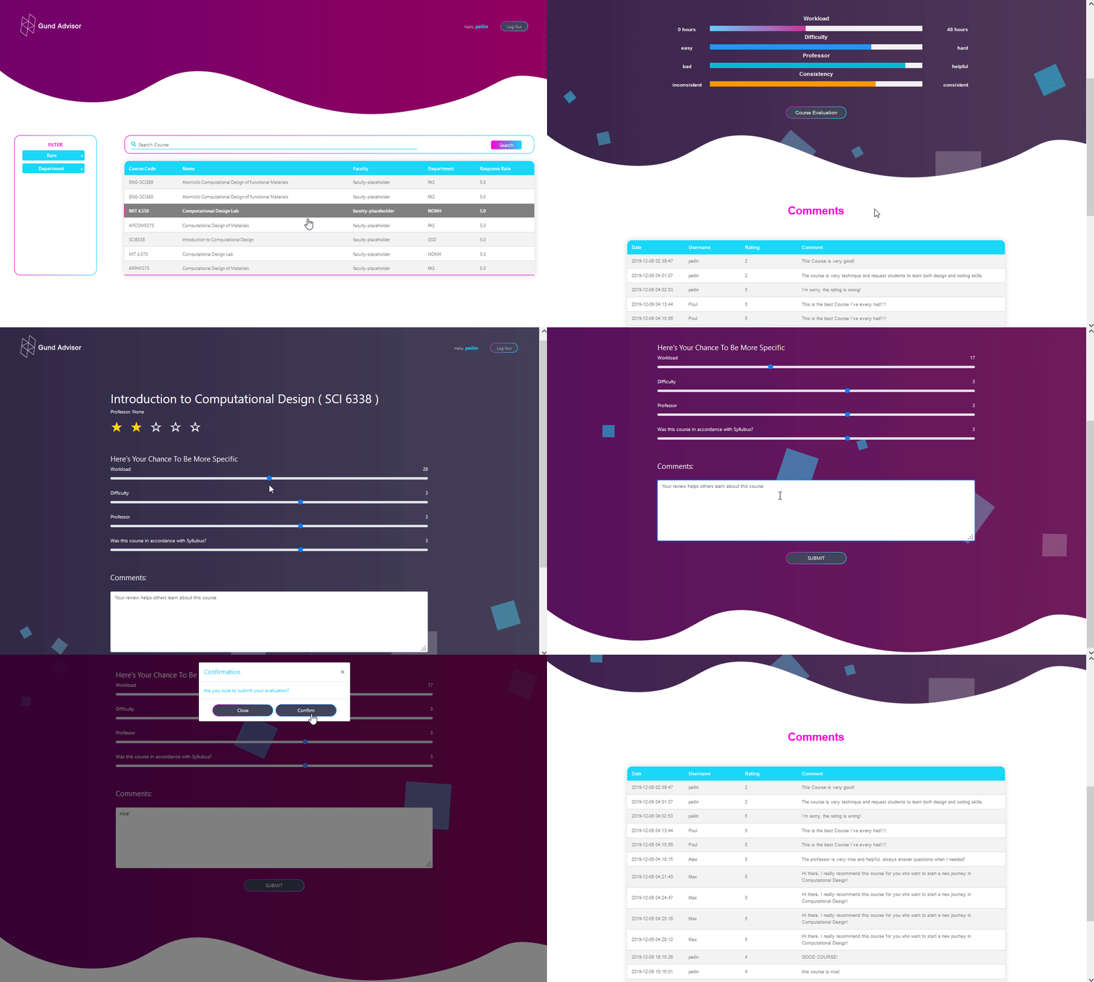
HTML AND CSS

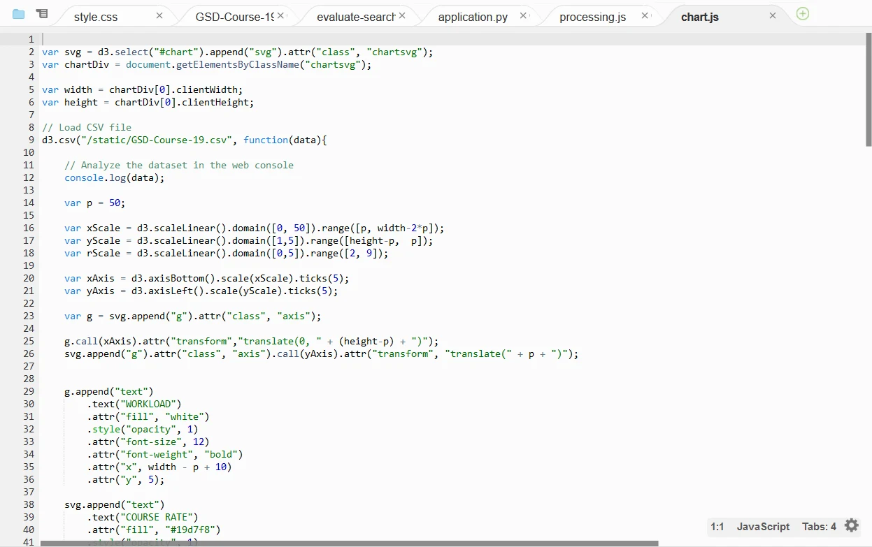
JAVASCRIPT
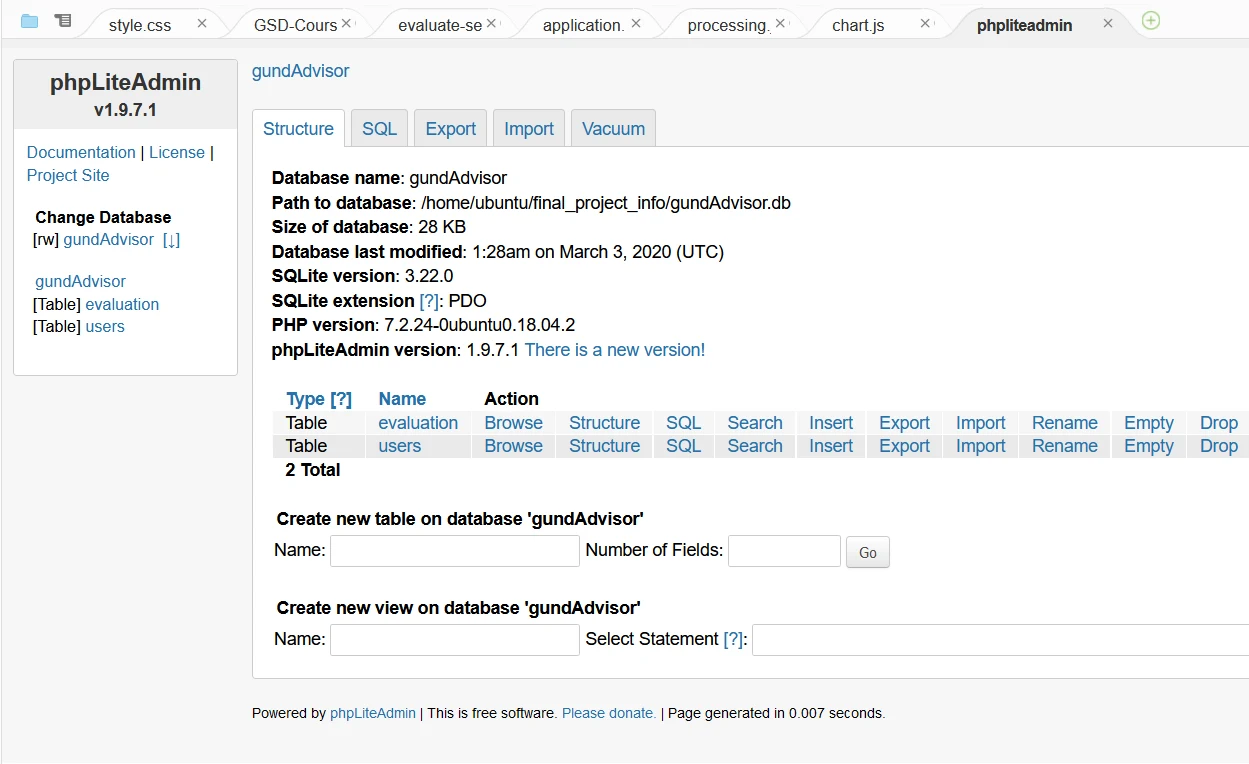
SQL DATABASE
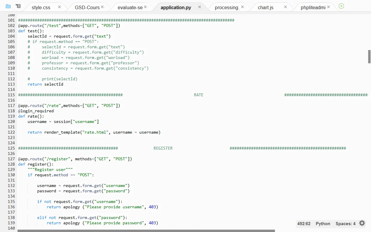
PYTHON
USABILITY TESTING
When looking at the stadium itself, we divide this complected building by 3 levels and 6 floors. People can see the realtime population density and attendant rates of all departments. As an individual, it will also be easy to know where are the closest entrances and exits.
Main Feature # 1
Select Concentrations
The app allows users to select their concentrations and interests when signing up, or setting up their profiles.
Main Feature # 2
Evaluate Course
When logged in, students will be able to evaluate the courses they selected in a certain time (middle and end of the semester).
Main Feature # 3
Search Function
In the search function, users can find the course by automatic recommendation, top courses, or search the course title manually and get all the details.
Main Feature # 4
Community
The last function is called community, which allows users to talk with their friends, or in groups.